| Страниц в теме: < [1 2] | Suboptimal web design Автор темы: Zea_Mays
|
|---|
Zea_Mays 
Италия
Local time: 01:05
Член ProZ.com c 2009
английский => немецкий
+ ...
Автор темы | on space usage and visual hierarchy | Jul 15, 2024 |
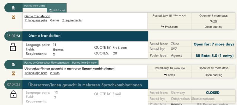
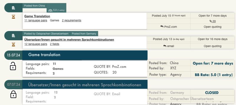
A little graphic produced with a simple program, not be meant for real implementation. Of course, this can be done better by pros, who would also have way better ideas. 
Just to show the visual difference (2 original postings and a possible alternative + how to show if a job posting is closed or open).
The white space below the green bars is still not being used optimally.
.
| | | | Zea_Mays
Италия
Local time: 01:05
Член ProZ.com c 2009
английский => немецкий
+ ...
Автор темы | Any news @ProZ? | Jul 17, 2024 |
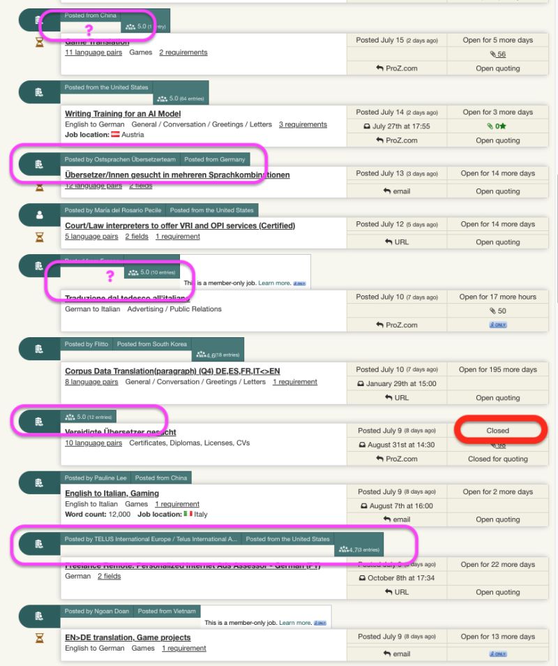
See current state below - that's really bad design, folks.
If you plan to stick to this design, I'd suggest - see pic above - to make at least the bars all of equal length and to put the relevant information there (date, job title) and to make other important information like open/closed immediately recognizable.
.
| | | | | Thank you for your comments and your patience. Please try accessing the "classic" search now. | Jul 17, 2024 |
Hi again, everyone!
Thank you for your comments and your patience.
Please try accessing the "classic" search now: https://proz.com/translation-jobs/ (and still located in the left side menu of the new search).
If you are still being redirected to the new search, please try clearing your cache and cookies!
Keep in mind that this page will eventually... See more Hi again, everyone!
Thank you for your comments and your patience.
Please try accessing the "classic" search now: https://proz.com/translation-jobs/ (and still located in the left side menu of the new search).
If you are still being redirected to the new search, please try clearing your cache and cookies!
Keep in mind that this page will eventually become unavailable, once the new version has been fully redesigned. The feedback you have shared with me in this thread is very valuable, and will all be taken into account when working on this redesign.
Regarding inconsistencies between one directory and the other, I do believe they are due to different search parameters, but, if you're not sure, I encourage you to submit a support request » with some examples so that we can look further into it.
And @Zea_Mays, these screenshots are very useful. It looks like the page styles are breaking for you —as you can see in the screenshot below, for other users, closed jobs are greyed out and the bars and boxes are aligned. Would you be able to open the developer console in your browser, and share with the support team a screenshot of any errors you are getting? This guide can help you retrieve that information.
Again, thank you everyone for your comments, and for your patience while we restored access to the page.
Finally, if you're interested in being a beta tester for any of the modernized pages we're working on, don't hesitate to let me know! ▲ Collapse
| | | | Zea_Mays
Италия
Local time: 01:05
Член ProZ.com c 2009
английский => немецкий
+ ...
Автор темы | console output | Jul 18, 2024 |
Hi Andrea, if it's of any support, I can help in beta testing if my time allows.
In private mode I see greyed out closed job.
Please note that the bars in your screenshot are aligned because they contain similar information; if there were more or less info, the length would change accordingly, which is visually annnoying. Plus, they have high level visual hierarchy but do not contain the most relevant information.
As for console output, please see it below for when logg... See more Hi Andrea, if it's of any support, I can help in beta testing if my time allows.
In private mode I see greyed out closed job.
Please note that the bars in your screenshot are aligned because they contain similar information; if there were more or less info, the length would change accordingly, which is visually annnoying. Plus, they have high level visual hierarchy but do not contain the most relevant information.
As for console output, please see it below for when logged in and when in private mode (text is partly in German):
Logged in:
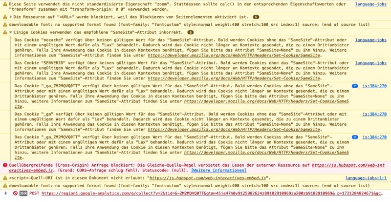
In private mode:
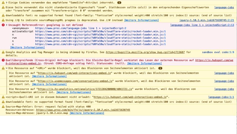 ▲ Collapse
| | |
|
|
|
Zea_Mays
Италия
Local time: 01:05
Член ProZ.com c 2009
английский => немецкий
+ ...
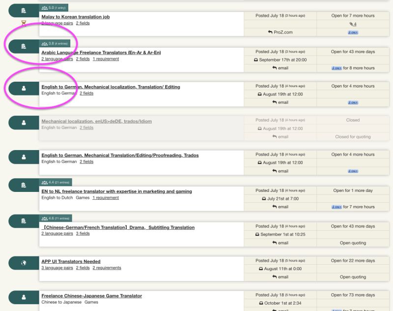
Автор темы | job page in private mode | Jul 18, 2024 |
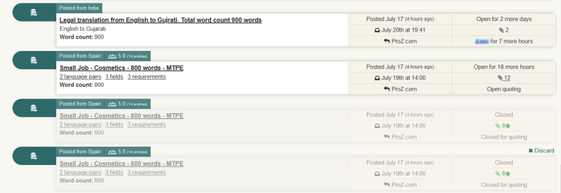
Here's a screenshot of the page in private mode, bar length changes with the amount of information they contain.
Closed jobs are greyed out.
I think that the symbol to the left in the bars (individual, agency etc.) is not main info and would suggest putting the publishing date there instead, all job related information under the green bar, and all information about the publisher on the right (see newly arranged example below).
Job page in private mode:
Suggestions on space usage:
[Bearbeitet am 2024-07-18 07:20 GMT]
| | | | | Страниц в теме: < [1 2] | To report site rules violations or get help, contact a site moderator: You can also contact site staff by submitting a support request » Suboptimal web design | CafeTran Espresso | You've never met a CAT tool this clever!
Translate faster & easier, using a sophisticated CAT tool built by a translator / developer.
Accept jobs from clients who use Trados, MemoQ, Wordfast & major CAT tools.
Download and start using CafeTran Espresso -- for free
Buy now! » |
| | Wordfast Pro | Translation Memory Software for Any Platform
Exclusive discount for ProZ.com users!
Save over 13% when purchasing Wordfast Pro through ProZ.com. Wordfast is the world's #1 provider of platform-independent Translation Memory software. Consistently ranked the most user-friendly and highest value
Buy now! » |
|
| | | | X Sign in to your ProZ.com account... | | | | | |